I Cut, You Choose: Dividing a Layout by Percent
Android does not support percent values for the layout_height and
layout_width attributes. Although the android.widget documentation is
curiously silent on the topic, there is a trick involving LinearLayout that
works more or less like you would expect.
The trick is described on Stackoverflow and elsewhere. Let's see how it works, and also why it sometimes isn't exactly what you need.
As an example, let's use a horizontal LinearLayout with 3 children. We want
the children to occupy 30, 50 and 20 percent of the available width. The
`layout_weight" attribute sounds promising, so here is an initial attempt.
<LinearLayout
    a:layout_width="match_parent"
    a:layout_height="wrap_content" >

    <Button
        a:layout_width="wrap_content"
        a:layout_height="wrap_content"
        a:layout_weight="30"
        a:text="1st" />

    <Button
        a:layout_width="wrap_content"
        a:layout_height="wrap_content"
        a:layout_weight="50"
        a:text="2nd" />

    <Button
        a:layout_width="wrap_content"
        a:layout_height="wrap_content"
        a:layout_weight="20"
        a:text="3rd" />

</LinearLayout>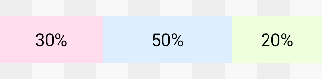
This looks almost right, but if you measure carefully you'll see that it's off
by a small amount. This is because layout_weight distributes only the
excess space -- whatever space remains after the child views are measured.
The difference becomes more noticable if we vary the text lengths.
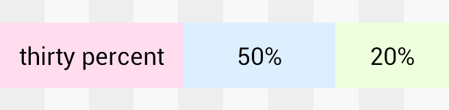
As one view grows, there is less excess space to distribute and the remaining views shrink. Note that although unhelpful to us right now, this is often a useful behaviour. It fits well with the Android philosophy that a single layout should work for a variety of screens and languages. On a more practical note: when you override it, it becomes your responsibility to ensure that there is enough space for the Finnish translation.
Leaving the Scandinavian market aside, how do we override LinearLayouts weight algoritm? Just set the width of each button to 0dp.
<LinearLayout
    a:layout_width="match_parent"
    a:layout_height="wrap_content" >

    <Button
        a:layout_width="0dp"
        a:layout_height="wrap_content"
        a:layout_weight="30"
        a:text="1st" />

    <Button
        a:layout_width="0dp"
        a:layout_height="wrap_content"
        a:layout_weight="50"
        a:text="2nd" />

    <Button
        a:layout_width="0dp"
        a:layout_height="wrap_content"
        a:layout_weight="20"
        a:text="3rd" />

</LinearLayout>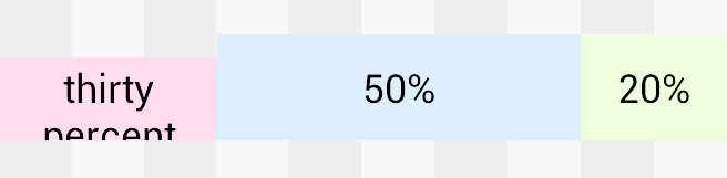
This tells LinearLayout to allocate no space at all to the children to begin
with. All the available space becomes excess space. And since the excess space
is distributed according to the weights, as we saw earlier, the result is
exactly right.
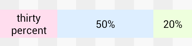
Not exactly right, I guess. Somewhere in Finland they are laughing at me. The split is perfect, but the text no longer fits on one line. And what's with the misaligned pink view?
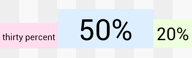
Look at that last image again, and pay attention to the vertical alignment.
The word "thirty" is perfectly aligned with "50%" and "20%". This is no
coincidence. When LinearLayout is in horizontal mode, it uses
getBaseline() on its children and tries to baseline align them. The
algorithm did its best, but our uncooperative 2-line text is making life
difficult for it.
If we tweak the font sizes a little bit, we can appreciate the baseline alignment when it's working as intended.
Baseline alignment is a beautiful thing, when you need it. Which turns out to
be not very often. The rest of the time it is annoying, messing up your layout
often in subtle ways. Luckily it can be turned off by setting
baselineAligned to false.
This is the final version of the xml.
<LinearLayout
    a:layout_width="match_parent"
    a:layout_height="wrap_content"
    a:baselineAligned="false" >

    <Button
        a:layout_width="0dp"
        a:layout_height="wrap_content"
        a:layout_weight="30"
        a:text="1st" />

    <Button
        a:layout_width="0dp"
        a:layout_height="wrap_content"
        a:layout_weight="50"
        a:text="2nd" />

    <Button
        a:layout_width="0dp"
        a:layout_height="wrap_content"
        a:layout_weight="20"
        a:text="3rd" />

</LinearLayout>
If you run into problems like those we saw earlier, or if you are curious
about how a LinearLayout is measured, you should take a look at the source
code.
Here's a link to the entry point for horizontal mode, and here's a
comment that talks about the 0dp trick. This trick not only provides fake
percent support, it is slightly more efficient too -- though only if you turn
off baseline alignment. Maybe you have seen Android's lint tool nag you to
turn off baseline alignment? It is trying to save you from a potentially
expensive call to measure().
One final note about android:weightSum, since it is often mentioned along
with layout_weight. There is one valid use for it; in case you need
to leave some of the excess space unallocated - example. In every other
case, it is better to let LinearLayout calculate the weight sum automatically.